Difference between revisions of "Navigation within Modules"
Jump to navigation
Jump to search
(Created page with "'''Overview''' * Most modules will consist of some sort of data grid * Each horizontal line represents an item of that type, and the vertical columns are attributes of that item * Some columns have an action that can be clicked on, or a tooltip which displays when hovered over * Most grids have add/edit/delete buttons (depending on Security Tokens) for the type of item displayed, as well as Export/Import/Custom buttons depending on the moduleFile:Add edit delete.p...") |
|||
| (2 intermediate revisions by the same user not shown) | |||
| Line 1: | Line 1: | ||
=== '''Overview''' === | |||
* Most modules will consist of some sort of data grid | * Most modules will consist of some sort of data grid | ||
* Each horizontal line represents an item of that type, and the vertical columns are attributes of that item | * Each horizontal line represents an item of that type, and the vertical columns are attributes of that item | ||
| Line 6: | Line 6: | ||
* Most grids have add/edit/delete buttons (depending on [[Security Tokens]]) for the type of item displayed, as well as Export/Import/Custom buttons depending on the module[[File:Add edit delete.png|none|thumb|421x421px]] | * Most grids have add/edit/delete buttons (depending on [[Security Tokens]]) for the type of item displayed, as well as Export/Import/Custom buttons depending on the module[[File:Add edit delete.png|none|thumb|421x421px]] | ||
'''Adjusting Columns''' | === '''Adjusting Columns''' === | ||
* The visibility of different attributes can be customised for each user by changing which columns are visible | * The visibility of different attributes can be customised for each user by changing which columns are visible | ||
* Right click on the topmost line of the data grid (the headers) → Select Columns | * Right click on the topmost line of the data grid (the headers) → Select Columns | ||
| Line 15: | Line 14: | ||
[[File:Change columns.png|none|thumb|808x808px]] | [[File:Change columns.png|none|thumb|808x808px]] | ||
=== '''Filtering and Searching''' === | |||
* Most data grids will allow filtering and searching using one or more criteria in the columns | |||
* Enter the search criteria in the row just below the column headers, in the column you are searching with (see below example searching using the Product Name) | * Enter the search criteria in the row just below the column headers, in the column you are searching with (see below example searching using the Product Name) | ||
[[File:Search column product.png|frameless|832x832px]] | [[File:Search column product.png|frameless|832x832px]] | ||
* Filtering can also be done by selecting the "Funnel" / Filter icon next to a header name that allows filtering [[File:Filter.png|frameless]] , see below for an example | * Filtering can also be done by selecting the "Funnel" / Filter icon next to a header name that allows filtering [[File:Filter.png|frameless]] | ||
*Check the tickboxes of criteria to use, see below for an example | |||
[[File:Filter product.png|frameless]] | [[File:Filter product.png|frameless]] | ||
=== '''Custom Filter Builder''' === | |||
'''Custom Filter Builder''' | |||
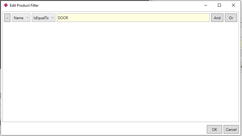
* Select the Filter icon at the bottom of the data grid [[File:Filter.png|frameless]] → select "Manage Filters" | * Select the Filter icon at the bottom of the data grid [[File:Filter.png|frameless]] → select "Manage Filters" | ||
* Add a filter, name it and select the filter criteria. Example below of showing only Products with "DOOR" in the Name | * Add a filter, name it and select the filter criteria. Example below of showing only Products with "DOOR" in the Name | ||
[[File:Filter builder.png|frameless|792x792px]] | [[File:Filter builder.png|frameless|792x792px]] | ||
Latest revision as of 09:03, 2 February 2023
Overview[edit | edit source]
- Most modules will consist of some sort of data grid
- Each horizontal line represents an item of that type, and the vertical columns are attributes of that item
- Some columns have an action that can be clicked on, or a tooltip which displays when hovered over
- Most grids have add/edit/delete buttons (depending on Security Tokens) for the type of item displayed, as well as Export/Import/Custom buttons depending on the module
Adjusting Columns[edit | edit source]
- The visibility of different attributes can be customised for each user by changing which columns are visible
- Right click on the topmost line of the data grid (the headers) → Select Columns
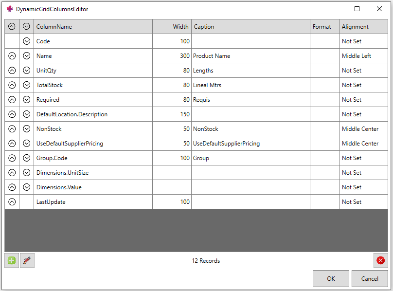
- This opens up the Columns Editor, which shows the attribute names, width, caption and order of the columns visible in the data grid
- Press on the green "add" button to add more columns for viewing → select the desired attribute from the list → change the caption and width if desired
Filtering and Searching[edit | edit source]
- Most data grids will allow filtering and searching using one or more criteria in the columns
- Enter the search criteria in the row just below the column headers, in the column you are searching with (see below example searching using the Product Name)
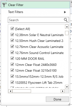
- Filtering can also be done by selecting the "Funnel" / Filter icon next to a header name that allows filtering

- Check the tickboxes of criteria to use, see below for an example


