DF Layout Header: Difference between revisions
Created page with "The Header layout item allows for collapsing of grouped form items under a header. Once created, it is expandable and collapsible, and, when collapsed, all items up to the next header or to the end of the form are collapsed under the header item. Inside the digital form, the user may tap on the header to expand or collapse it. == Fields == === Header === The "Header" field determines what the displayed text in the header will be - this should be a short description of..." |
|||
| Line 2: | Line 2: | ||
== Fields == | == Fields == | ||
[[File:Header Properties.png|thumb|558x558px|Header Properties]] | |||
=== Header === | === Header === | ||
| Line 10: | Line 11: | ||
The "Collapsed" field determines whether the header is collapsed by default - if ticked, the header will be collapsed when opening the form and must be tapped to open. If not ticked, the header will be expanded when opening the form, but the user may collapse if they want. | The "Collapsed" field determines whether the header is collapsed by default - if ticked, the header will be collapsed when opening the form and must be tapped to open. If not ticked, the header will be expanded when opening the form, but the user may collapse if they want. | ||
== Example == | |||
[[File:Preview header.png|thumb|607x607px|Preview mode]] | |||
The following example demonstrates an example form with two headers, and how they appear on the Desktop. | |||
[[File:HeaderDesign.png|left|thumb|631x631px|Design mode]] | |||
Latest revision as of 05:09, 12 December 2022
The Header layout item allows for collapsing of grouped form items under a header. Once created, it is expandable and collapsible, and, when collapsed, all items up to the next header or to the end of the form are collapsed under the header item. Inside the digital form, the user may tap on the header to expand or collapse it.
Fields[edit | edit source]

Header[edit | edit source]
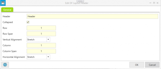
The "Header" field determines what the displayed text in the header will be - this should be a short description of what form fields are grouped under this header, so that when the group is collapsed, it is clear what fields have been collapsed under the header.
Collapsed[edit | edit source]
The "Collapsed" field determines whether the header is collapsed by default - if ticked, the header will be collapsed when opening the form and must be tapped to open. If not ticked, the header will be expanded when opening the form, but the user may collapse if they want.
Example[edit | edit source]

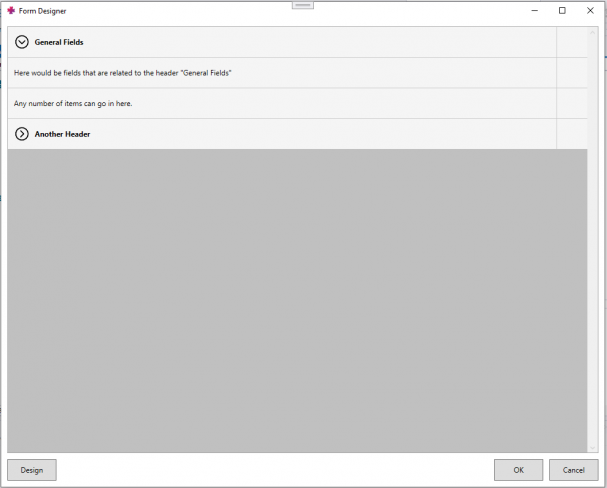
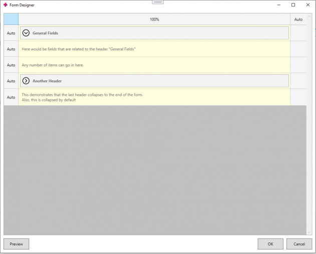
The following example demonstrates an example form with two headers, and how they appear on the Desktop.
